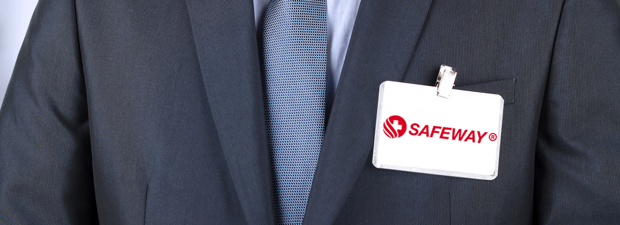
We attempt to reflect our brand as a customer service with total safety and quality. We design a new logo that reflects technology, progress, and health. Our brand color is red – the color of excitement and progress, which promotes safety and try to be the best. The other color is white which give you peace and trust of quality, while the 3 waves under the logo represent a technical examination. In addition, the plus sign represents the incorporation of customer and Safeway to achieve more quality. This logo is a mark of safety and quality tested by an independent and organization.
But behind of our logo, there is a pathway which gives you safety, precision, quality, peace and more clients. All of above mentioned enabling our customers to power ahead safely with more financial advantages. Our physical quality control is carried out through Testing, Auditing and Certification services and also our quality control confirms that operating procedures and systems are functioning properly.

